Personalizing a Digital Experience for Credit Union Members and Community
About
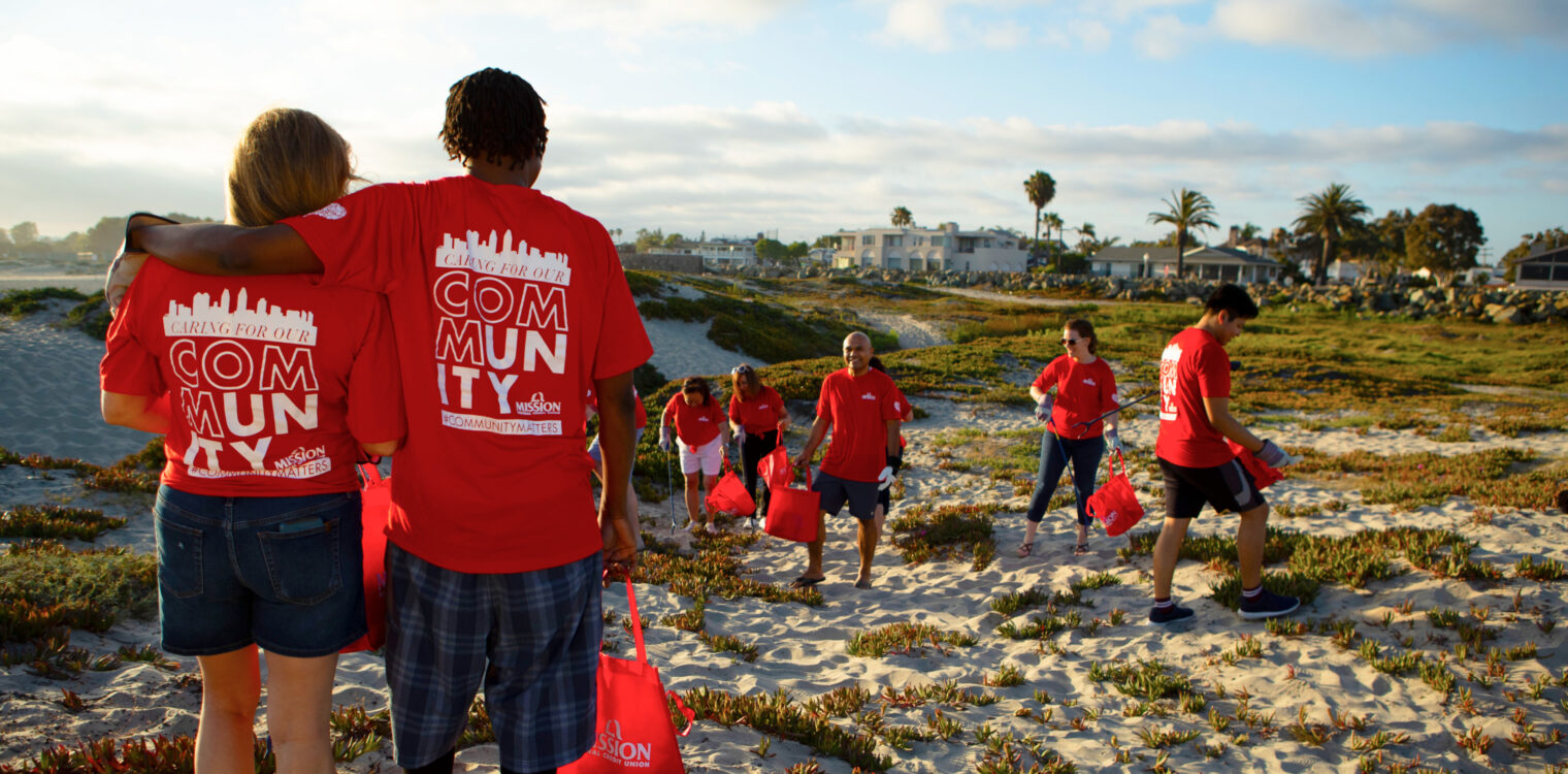
Mission Fed Credit Union (Mission Fed) is a financial institution that believes its community is everything. What began as a credit union for teachers with a single desk in a San Diego school in 1961 has grown to a financial institution with 34 branches, dozens of ATMs located in neighborhoods around San Diego County and thousands of co-op ATMs nationwide.
Problem Overview
Mission Fed wanted a digital experience that underscored the credit union’s commitment to its 268,000 members and the greater San Diego community. The project’s primary objective was to help quickly connect people with the information and services they needed which included mobile banking, neighborhood branch information and locating 30,000 co-op ATMs across the nation.
Research Reveals Pain Points and Opportunities
SiteCrafting’s user research team conducted two stakeholder workshops to identify how users were using the Mission Fed website. The website helped our team understand the actions they were taking on the website, and the frustrations they experienced. The UX team combined the data from the workshops with user insights gathered through interviews, website feedback and analytics. This combined data-informed priority for testing new navigation and helped establish user-centered requirements for the website build.
Among the requirements that resulted from the research phase of the project were recommendations for information architecture that connected member needs with Mission Fed’s goals. These recommendations included prominent calls to action throughout the website, streamlined information on product pages, a searchable help center and storytelling content patterns to be featured throughout the website.
Designing for Community, Developing for Flexibility
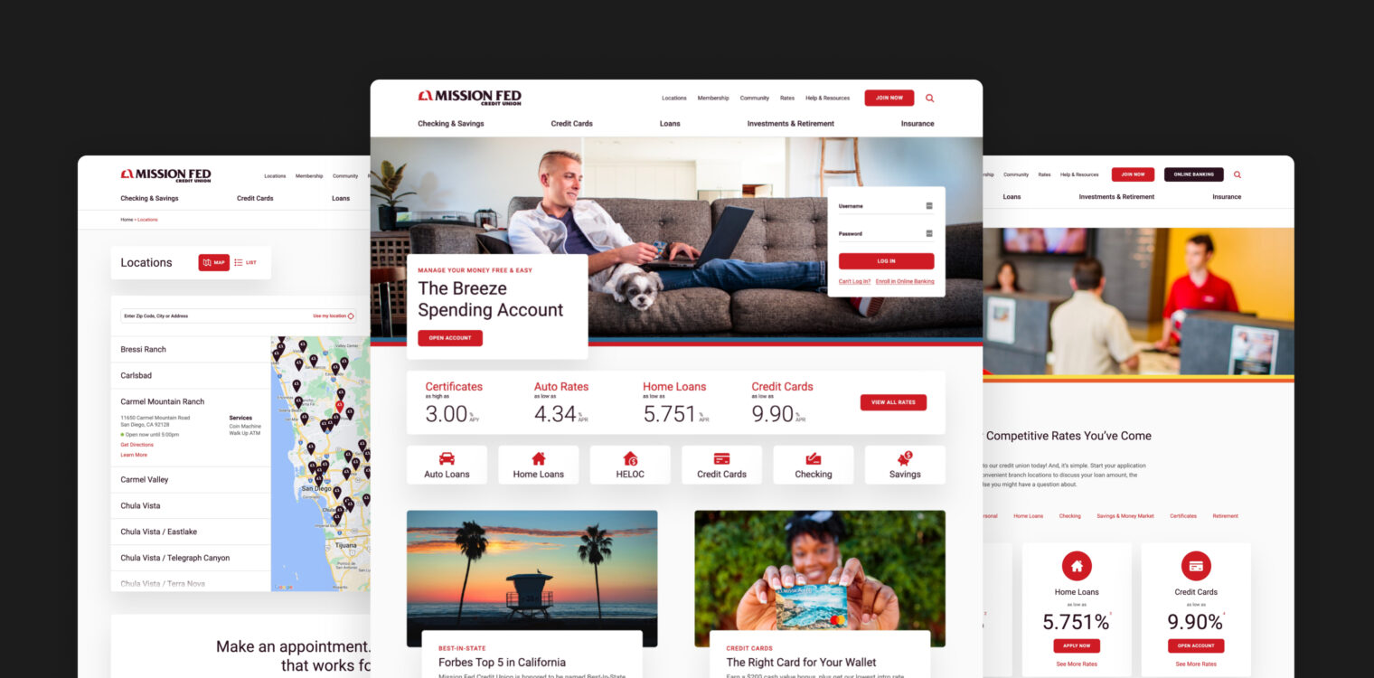
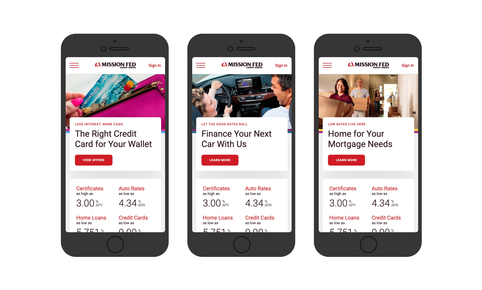
The new website design integrated Mission Fed’s brand ethos — community — with research findings and recommendations — prioritizing engagement — to create a digital experience that amplifies the experience members say sets Mission Fed apart from other financial institutions. The redesign is fully responsive and optimized for mobile. The updated design is fresh, friendly, and approachable — and reflects the diversity and various regions of San Diego.
A large-size credit union makes for a website with a large volume of data to process. Our development team created a map feature that allows people to explore information and find locations near them via maps that load quickly and display accurate information. The rates module on the website connects members with accurate information across all loan types and is centrally managed by the Mission Fed team. Branch hours can easily be updated and customized by location.
A customized search feature powered by SiteCrafting’s Sitka Insights allows search engine results in the Help & Resources section of the website to link to an open accordion. The search feature on Mission Fed’s new website is optimized to help members find the information they need. For example, if a member is searching for the credit union’s routing number, the routing number will appear as the first result and related information will be displayed and linked below it.
Blending Content Strategy and Story to Create Pathways for Engagement
Mission Fed’s website consisted of 650 pages of content, much of which featured duplicate and inaccurate information. SiteCrafting’s digital strategy team began with a site audit to find pages that could be condensed and deleted to streamline content and improve the user experience in alignment with UX research findings. In total, 200 pages were eliminated and information was condensed and reorganized to reduce redundancies and errors.
The insights gathered during the UX phase of the project guided the organization of content throughout the site based on popular topics/services and how visitors clicked through the website. The insights provided a foundation for new content patterns that create a range of opportunities for presenting information in ways that highlight community service and connections throughout the website.
Journey maps and persona work streamlined Mission Feds 13 marketing personas into four website user personas. wrapped in life context and banking behaviors to optimize the intersection of members’ interests, values and financial needs. These new content patterns provide clear paths for website visitors to engage with the content they were looking for.
Bringing the Brand Forward
SiteCrafting developed a messaging strategy and framework that created consistent copy across the website informed by UX findings, brand strategy, marketing goals and content strategy. The framework included voice and tone guidelines and leveraged Mission Fed’s brand purpose, personality, mission and vision to establish a messaging approach and four message pillars that are the foundation of the updated messaging on the website.
The copywriting team collaborated with Mission Fed’s marketing team, compliance division and subject matter experts throughout the credit union to write copy that conveys the ethos of Mission Fed with accuracy and attunement. When the copy was complete, SiteCrafting’s content strategy team stepped in to transfer all of the content to the new website.

Good for Mission Fed, Good for All
Mission Fed’s website achieves every credit union’s dream: A digital experience that matches the in-person experience members know and trust. For members, it means quick access to relevant information. For the Mission Fed team, it means changes can be made in one field on the back end and translated to multiple places on the member-facing side of the website.
Contributors


Next Case Studies