
The ABCs of ADA: How to Start Making Your Website Inclusive for All

ADA compliance is a prevalent topic and something we deal with at SiteCrafting regularly. It can be a bit overwhelming knowing where to start. Luckily the simplest place to get started is your content. Not just with the words written, but how you format that content and lay it out on the page will make a big difference.
This is something we help our clients with regularly so to give you some tips and inspiration I’ll walk you through a recent project where we did just that.
My task was to take an older site – not unlike many out there and make recommendations for ADA compliance. As a disclaimer some updates did require design and development changes, however there were a lot of changes that were handled within the content itself that I’ll touch on here.
The content issues I addressed could be fixed by paying attention to 3 categories that you can use to audit your current content right now:
A. Content Formatting
B. Text & Images
C. Low Contrast
A. Content Formatting: Get Organized
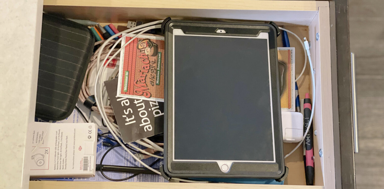
Ok we’re all friends here. Time to come clean. We all have that drawer in the kitchen where all the random but very useful items go to die live. You know what I’m talking about. Mine (shown above since we’re being honest and all) apparently has all the charging cords for every device in my home, pens, a lighter, tape, random easy to lose toy parts, take-out menus, some batteries and some change.
I would argue everything in there can’t be tossed – for me it’s helpful and needed. However each time I go to that drawer it usually involves a small search and rescue mission that requires pulling most of the contents out to find the one thing I need.
I think we can all agree that this method is not the best way to organize and doesn’t help make finding the thing you need easy. You know where to go to start looking, but now you have to invest extra time into extracting what you actually need.
Ok tough love time friends, we can get away with this in our kitchens, but it is not effective with our web content.
Does your user find their way to your contact page only to be overwhelmed with seven headlines in all caps, random off-brand colors, and heavy blocks of text that have nothing to do with your contact information? Congratulations you just landed them in a junk drawer, and while you may take the extra time to find that Sharpie in the back, your user will not. They will leave frustrated — and without accomplishing the task they came to your website for.
So to start, even without getting into the specifics of your actual content, the layout needs to be visually easy to parse. There should be a hierarchy in your typography and white space that leads the user through your content easily.
Here’s an example of the contact page before and after:
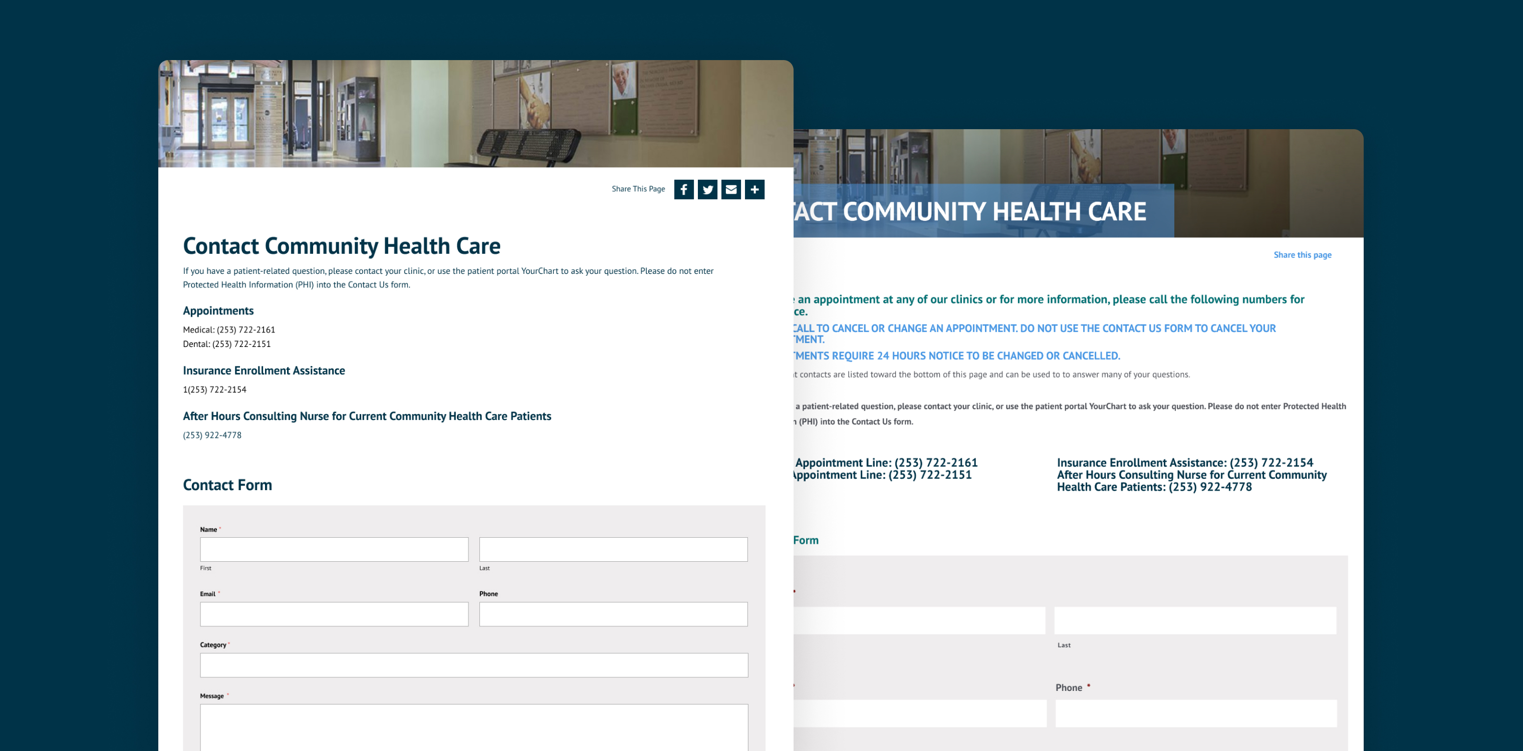
It is easy to fall into using headlines and all caps for the “important” information, but remember if you’re in a room where everybody is yelling you won’t be able to walk away having heard anything.
- We removed the all caps headline & color (more on color in the contrast section) and refined that content to be intro copy that just covered what was necessary
- We used simplified headlines and their color to break up the content by category to make it really easy to scan and skip to what section important to the different users needs. We only used two distinct sizes to help the hierarchy to flow from the main headline right into the content sections.
- We also removed extra secondary contact information that just added visual noise.
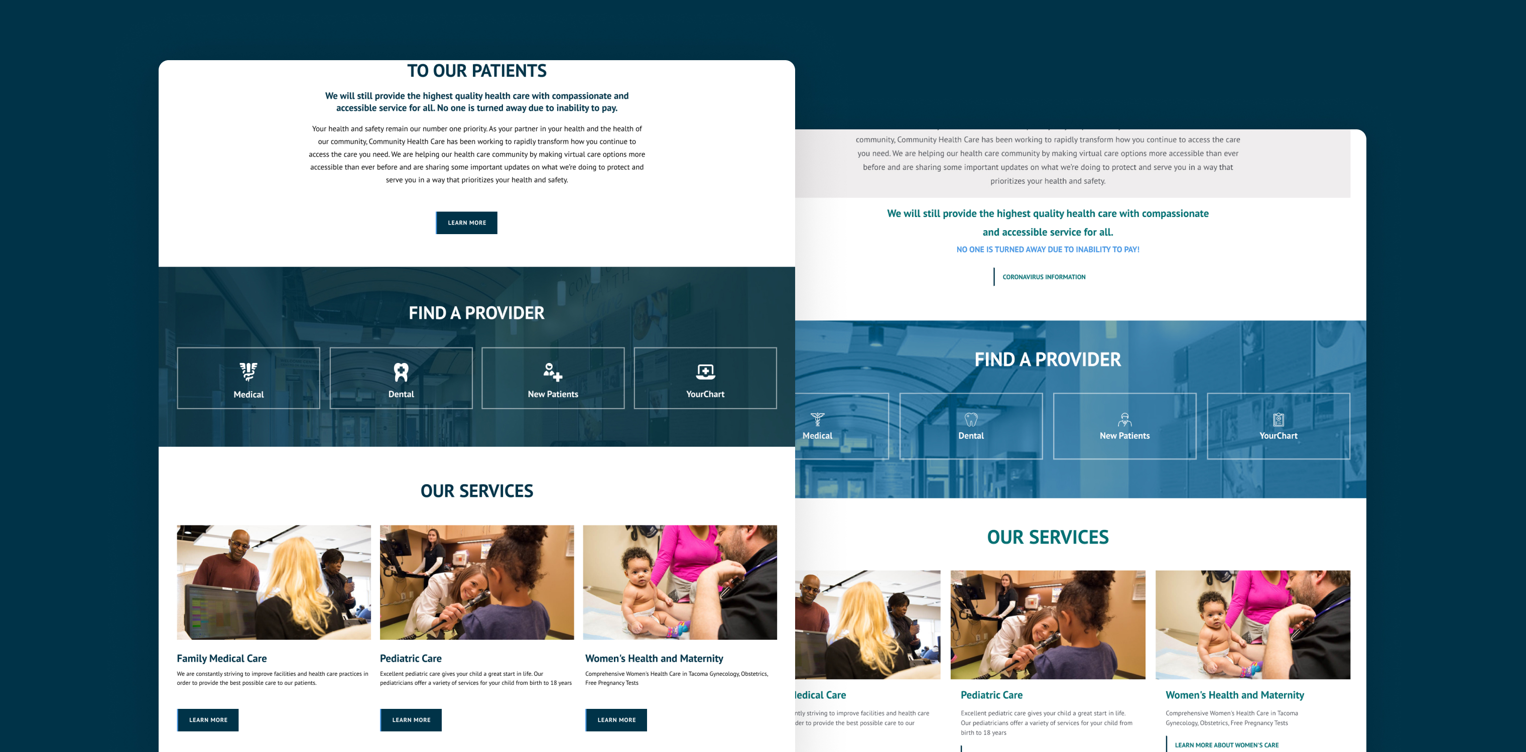
Here is a location page before and after:
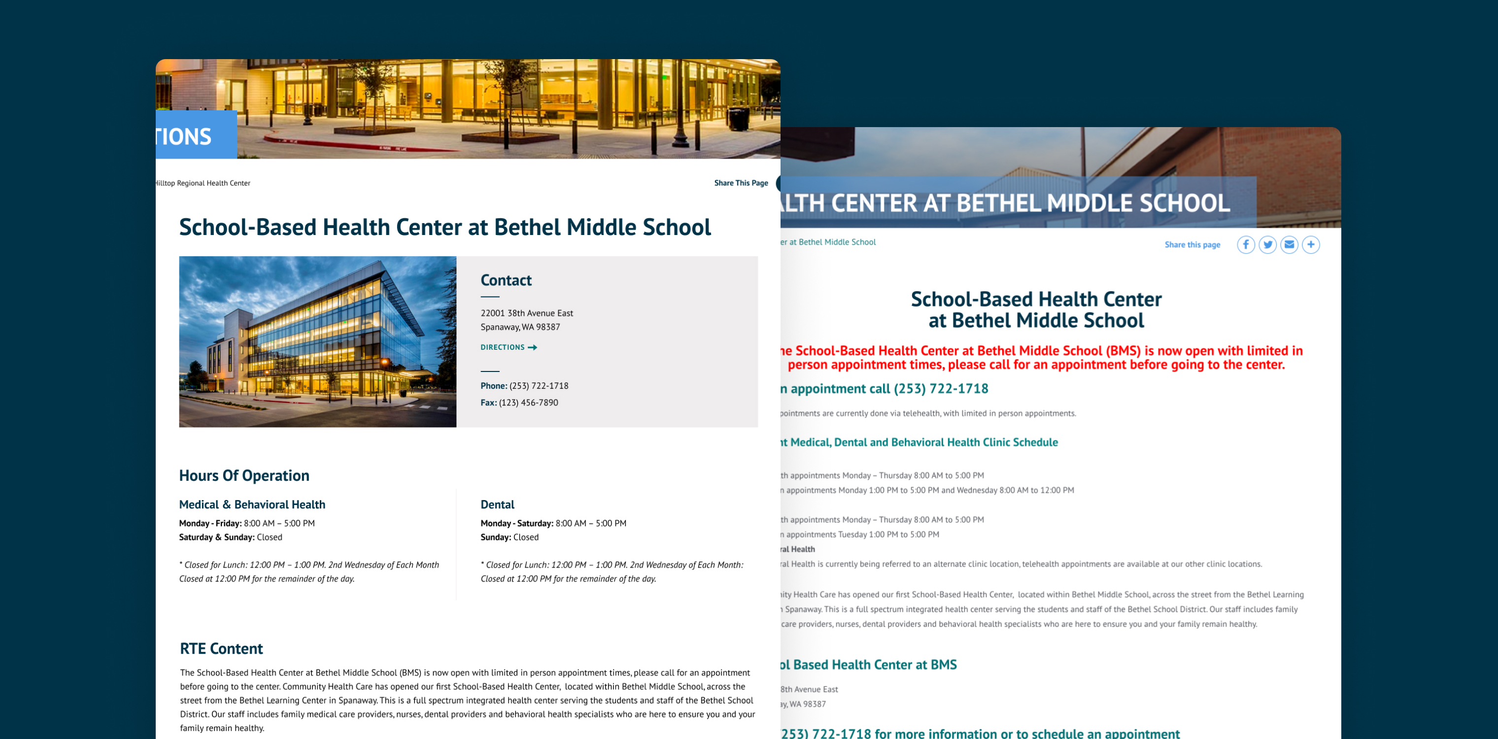
Now isn’t that easier to find what you’re looking for? Relatively minimal formatting changes completely changes the experience. Instead of a long page of text, breaking the page up into separate chunks of content helps the eye parse the information and scan to whats most important to the user.
Need more? Here are several additional tips regarding content from my Inclusive Design Webinar:
- Use easy accessible language whenever possible
- Write in a journalistic style: make your point and then explain it
- Avoid unnecessary jargon and slang
- Use images, diagrams or multimedia for a visual translation of the content
- Chunk your content
- Use white space
- Include a glossary for specialized vocabulary and provide definitions in simpler language

B. Text & Images: the Good & the Bad
The Good
More or less most people now know about using alt tags on images, but it’s still so easy to skip this step. Sometimes it’s just that we get focused on uploading the images into our blog post and moving on. We don’t think about taking a second and adding all the data for that image that makes it accessible. Be like Nike, just do it; it’s important. In many cases, your CMS will autofill it for you but nine times out of 10 it’s not doing it in a helpful way. Describe the picture in your alt tag like you were describing it to your MeMaw or Tutu over the phone. An auto populated tag that repeats your blog post title with every picture isn’t helping Tutu at all.
The Bad
Do not use images to relay textual information. For one it is not responsive friendly meaning it does not respond down well to smaller devices. In most cases it wont display crisp on hi def screens and a big miss is it’s not searchable.
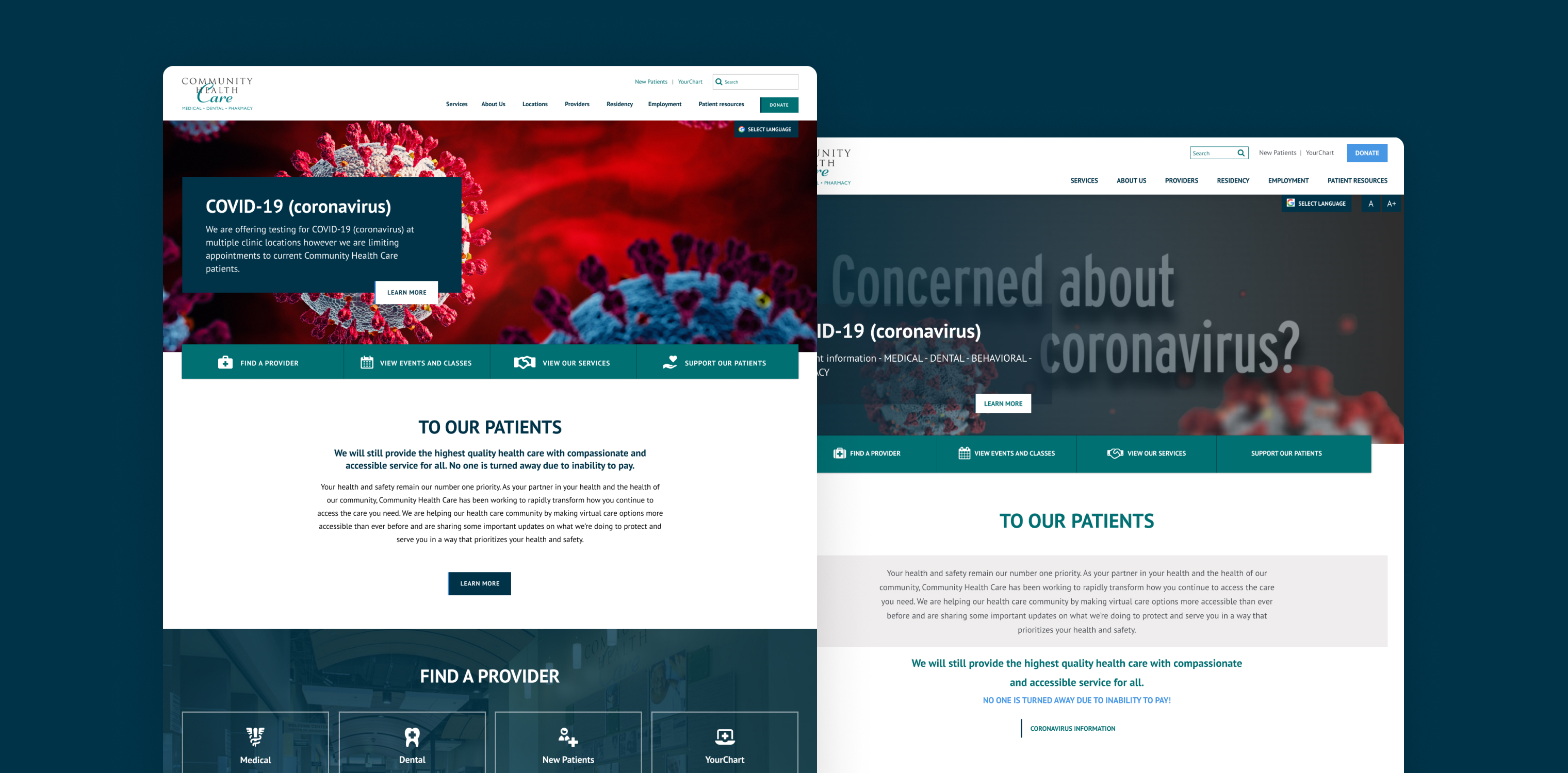
With this site it was completely unnecessary from the content side as there was already a text area with this information being stacked over the top of the other messaging within the image which hits on both this step and step A above regarding content flow and guiding the users eyes through your content easily.
Swapping out the image to one without text lets the content area do its job better while making the image more compelling.

C. Low Contrast
Low contrast is one of the biggest issues that can happen in the design phase if you aren’t careful. It can in two primary ways:
- Text over imagery
- Low Contrast Colors
Text Over Imagery
In a lot of cases site designs allow for text areas over customizable background images and colors. In our project there was an icon CTA banner with a background color & image.
They were using one of their lighter brand colors and a very light weight iconography set. Just using a darker brand color and bolder icon set made all the difference.
Low contrast text colors
When we start a fresh design for a client or do an audit for existing designs we’ll generally run tests on their brand colors to create a key of sorts to show what combinations pass ADA and which fail. This can help guide the client on how their branding fares and also becomes a tool we can then use as we design out new elements to quickly check and make sure everything passes.
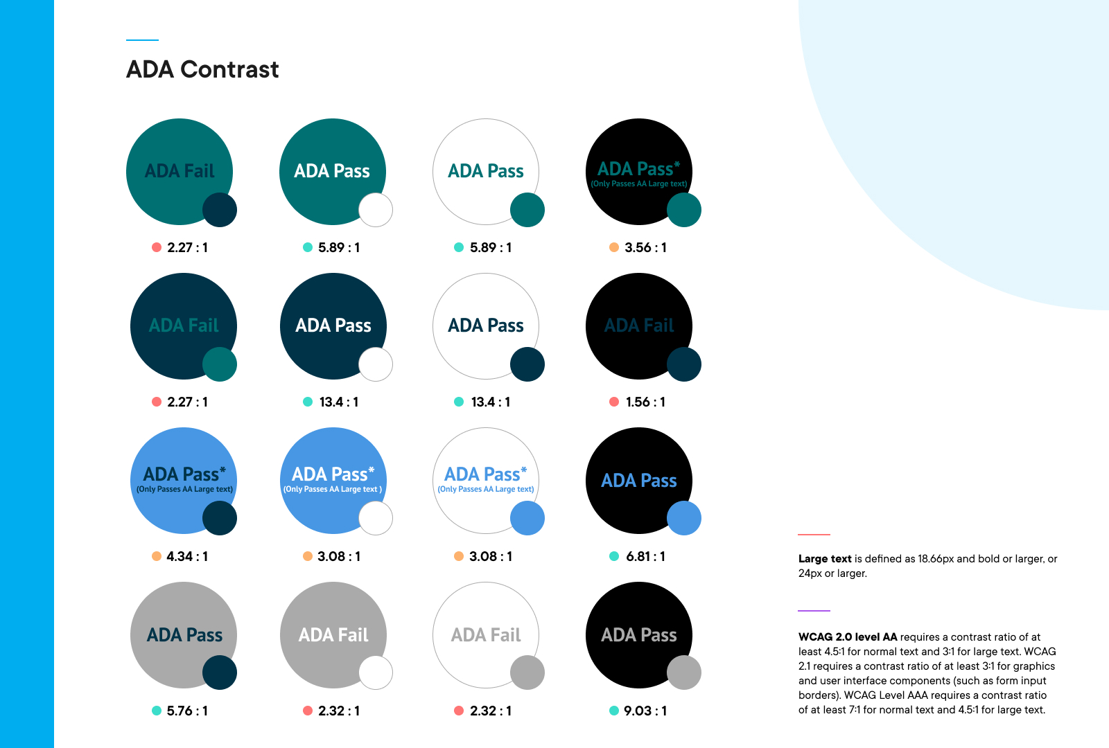
WCAG 2.0 level AA requires a contrast ratio of at least 4.5:1 for normal text and 3:1 for large text. WCAG 2.1 requires a contrast ratio of at least 3:1 for graphics and user interface components (such as form input borders). WCAG Level AAA requires a contrast ratio of at least 7:1 for normal text and 4.5:1 for large text. Using that information we can map out any possible trouble areas.
We use many tools for running these tests. Some are plugins within our design software but there are also many that you can use to run some of your own tests to see if there are any quick fix opportunities.
If interested here are a couple tools to get you started:
Contrast Checkers
Simulate Disabilities
- Chrome Plugin: Funkify
Test Accessibility
Cheers to you friend, you’re reading this post, you’re learning new things, and even with just that you can make the decisions needed to make a difference. With these three steps at your disposal you should be able to get a good idea of where you’re at and where to start. Not only with your web presence but more importantly you’re helping to make the web more inclusive for everyone.
Still need a hand? No worries reach out, we’re here to help.
Related Articles