Rebuilding Hope Sexual Assault Center has been a cornerstone of support and advocacy in Pierce County for more than 50 years. As the organization grew into Kitsap County, it recognized the need to refresh its brand to reflect both its mission and the broader community it now serves.
Most of my work at SiteCrafting centers on designing for web applications, so it’s always a welcome shift to dive into a visual brand project. Over the years we’ve honed our approach to branding, and I love any chance to collaborate with my creative counterpart Jen Rittenhouse (SiteCrafting’s brand manager and my dog Frankie’s third favorite person in the office).
With the expansion, Rebuilding Hope saw an opportunity to align its identity across both counties and build stronger awareness of its work. We partnered with their team to reimagine a brand that felt honest, grounded and connected to the people they support. The result wasn’t just a new logo or set of guidelines — it became so meaningful that one team member decided to make it permanent.
The Need for a Brand Refresh
Rebuilding Hope’s existing logo and brand assets had served the agency well for years, but with growth came the opportunity to evolve. The goal was clear: create a visual and verbal identity that amplifies the mission, welcomes those seeking support and builds stronger connections with donors, staff and the broader community.
During our brand workshop, three priorities rose to the top: recognition, connection and destigmatization. Rebuilding Hope provides critical resources and services to victims and survivors of sexual assault in Pierce and Kitsap Counties. While many in the community assume a resource like this exists, this brand refresh helps make that presence more visible. It offers clarity, credibility and new ways for people to engage with the organization.
The Power of Symbols
In conversations with the Rebuilding Hope team and during our branding workshop with stakeholders, we learned that the fractured heart in the existing logo was more than just a mark, it was a meaningful symbol that reflected both the pain and resilience of survivors. Teal, already widely recognized for sexual assault awareness, remained a natural foundation for the refreshed visual identity.
We explored a range of hopeful imagery, things like butterflies, the warmth of the sun and the sense of a fresh start that comes with a new day. Among the concepts we explored, we kept returning to the idea of a sunrise. It captured the spirit of healing and forward movement, and the story behind it resonated deeply. It also opened the door for a more expressive color palette, expanding beyond teal to include yellow for warmth and joy. The purple symbolizes the anti-domestic violence movement, close allies in the work Rebuilding Hope does.
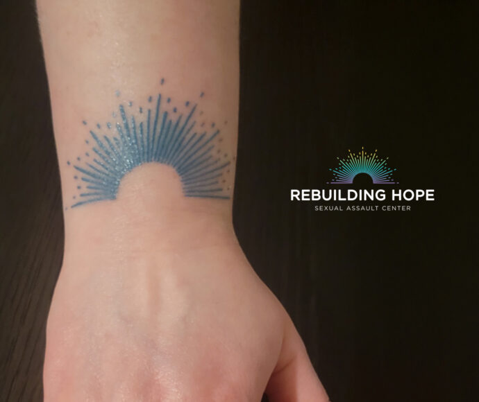
A Logo That Leaves a Lasting Impression
The final design struck a deep emotional chord. It resonated so profoundly that the agency’s Board President, herself a victim-survivor of sexual assault, took an extraordinary step: she got the new logo tattooed on her wrist. This act underscores the personal connection and significance of the brand refresh and proof that the new identity wasn’t just a design, but a reflection of Rebuilding Hope’s impact. It’s also the first time I’ve designed a logo that has become a tattoo.
More than a logo, this brand refresh became a symbol of strength, support and healing — a lasting mark on both the organization and the people it serves.